Taking the color out
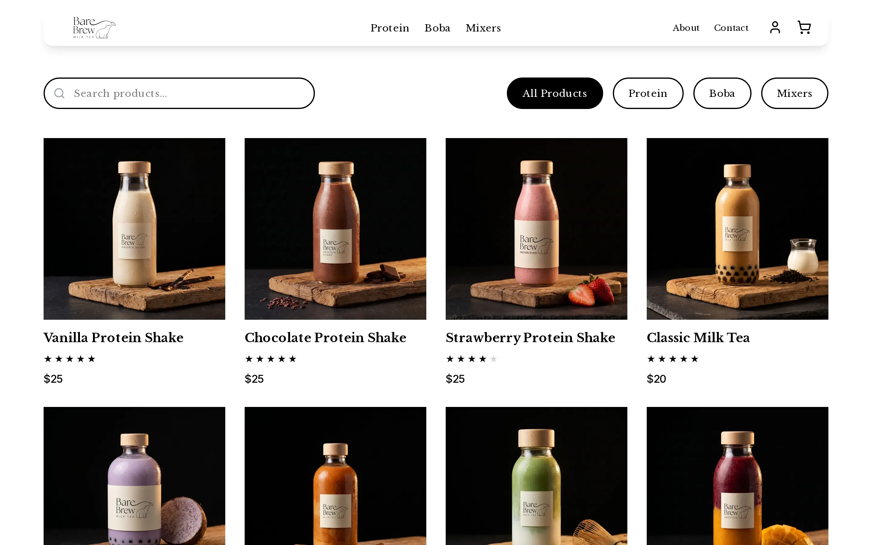
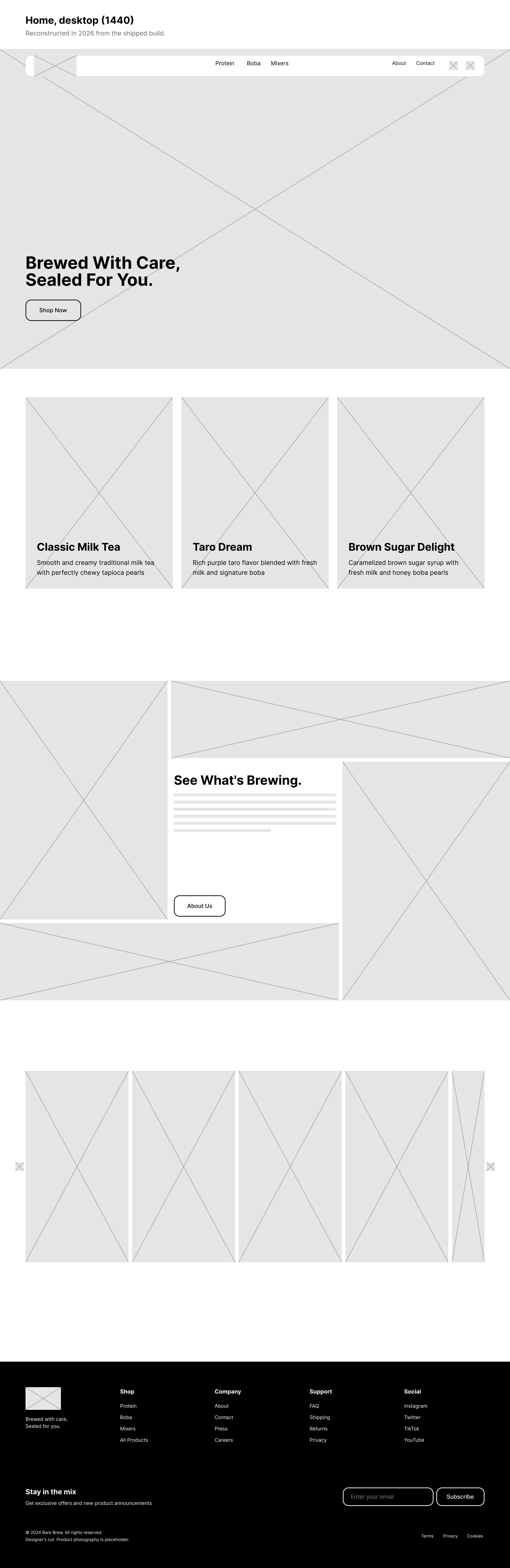
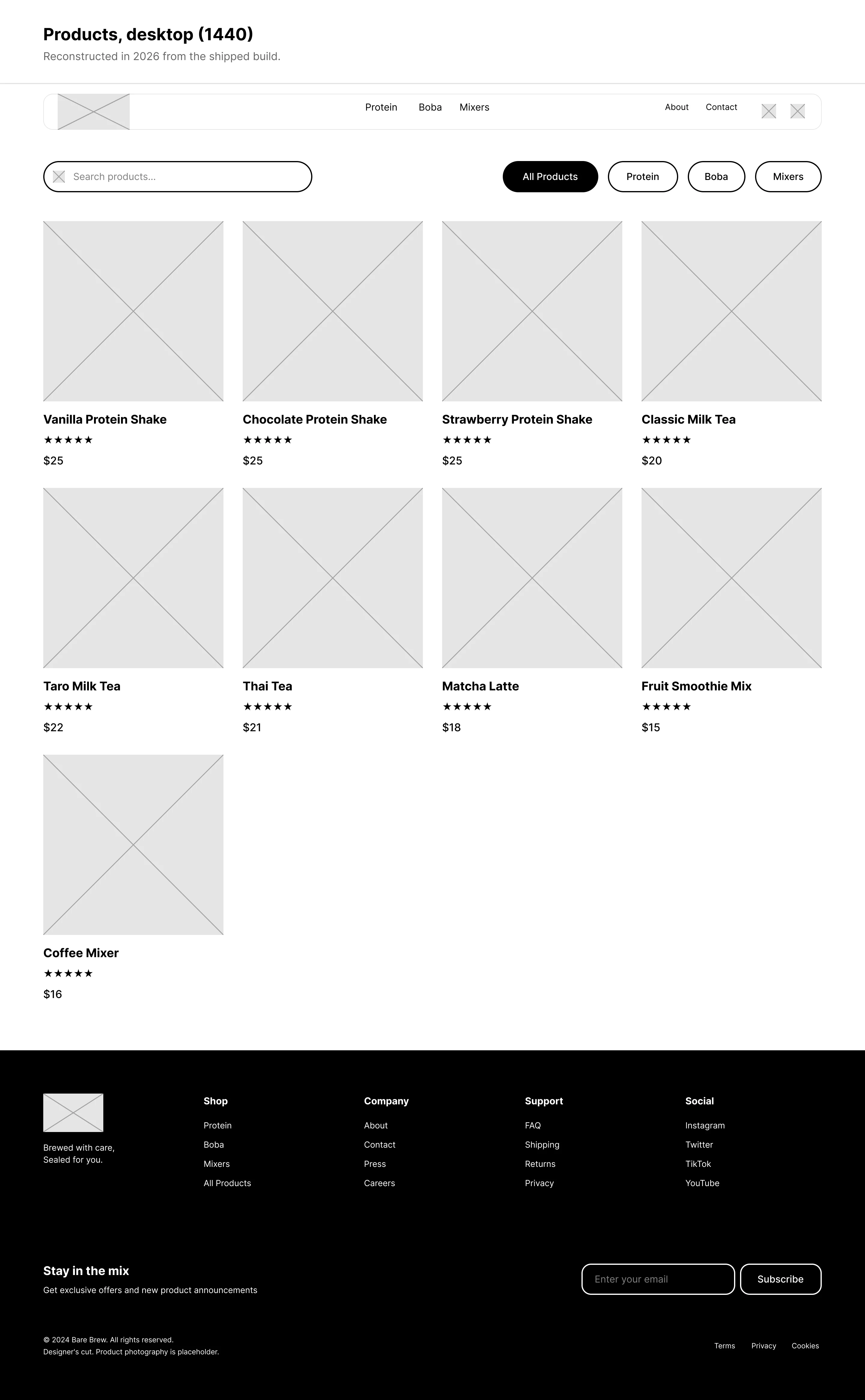
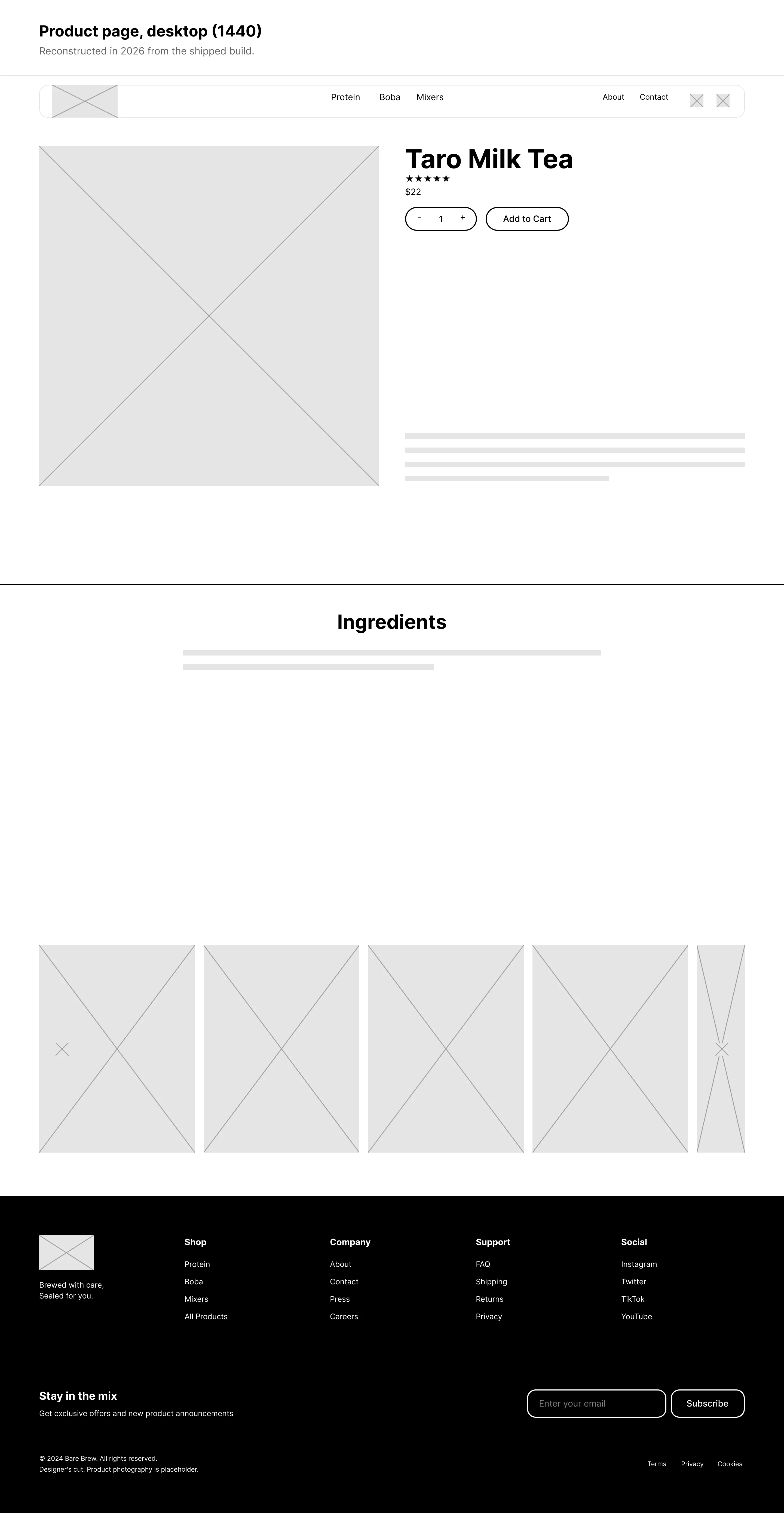
The interface only uses black, white and one light gray. The nav, buttons, headings and rules all stay in those, so on any page the only color is in the photos of the drinks.
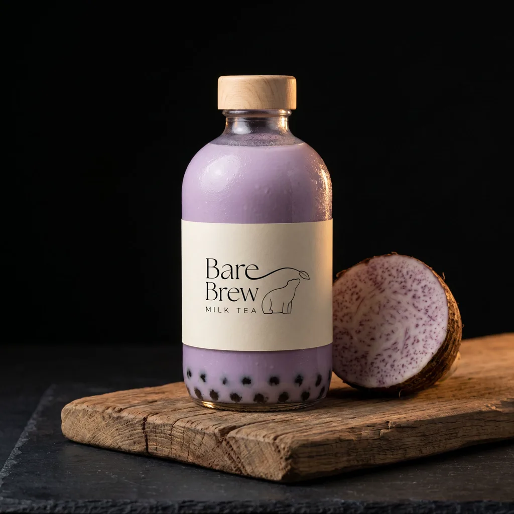
That put a lot of weight on the photography. With nothing else on the page competing for attention, a weak product shot is obvious.